Wonx Portfolio
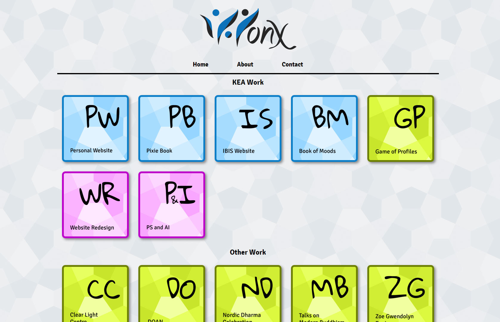
I developed this website as part of my first semester portfolio evaluation. We were required to create website that showcased our work from the first semester at KEA and anything else we had worked on. The website for me was an experiment in responsive design, colours and textures.
The idea behind the colours used in the website is that different colours would reflect different types of work. Blue representing websites created using basic HTML and CSS, green using WordPress and pink was reserved for other things like Photoshop and Illustrator.
You can visit the website here and see some of my other work, which is not featured on this website.
